Monthly Archives: September 2011

Understanding qq-plots

qq-plot is short for quantile-by-quantile plot. You plot one quantile against another and you see if their coordinate pairs form a straight line. One of the quantiles is your sample observations placed in ascending order. For example, you take the height of 30 people and place them in order from smallest to largest. That will be your y-axis values. The other quantile will be the quantiles of a probability distribution that you believe your sample may have come from. For example, you may think your heights are Normally distributed. So your x-axis values would be the quantiles of a standard Normal distribution. Since you have 30 heights, you’ll need 30 Normal quantiles. The way that’s done is to find the quantiles for \( \frac{1}{31} , \frac{2}{31} ,\dots, \frac{30}{31} \). In other words you solve for z in \( P(Z \le z) = \frac{1}{30}\). That turns out to be -1.85. And then you do the same for all the fractions. Finally you plot your heights versus the z-values and see if they’re in a somewhat straight line. If they are, then you can be pretty safe in your assumption that your sample comes from a Normal distribution.

For Normal distributions this can be made intuitive by recalling the standard Normal transformation: \( z = \frac{x-\mu}{\sigma}\). That’s the formula we use to create z-scores, which allow us to use the standard normal distribution to find probabilities. Solving for x we get \( x = z\sigma + \mu\). You may notice that looks just like the formula for a straight line but with different variables. Remember this one from algebra? \( y = mx + b\). That’s what we have but with the mean (\( \mu\)) serving as the intercept and the standard deviation (\( \sigma\)) as the slope. And instead of y and x, we have x and z. If we wanted to make a straight line, we would plug in our z-values into \( x = z\sigma + \mu\) and find our x values. That would give us a set of coordinate pairs that we could plot and then connect the dots to make a straight line.

Now of course we don’t know \( \mu\) and \( \sigma\). We have to estimate them from our sample. Furthermore we don’t know if our sample came from a Normal distribution. But when constructing a Normal qq-plot, we assume our sample did come from a Normal distribution. We have our straight line formula \( x = z\sigma + \mu\) and our x values. If our x values came from a Normal distribution, then they would have corresponding z-scores. We don’t know what they are (because we don’t know \( \mu\) and \( \sigma\)), but we can estimate them with the quantiles of a standard normal distribution, with the number of quantiles equal to our sample size. Let’s do this in R. We’ll generate a random sample of 30 observations from a Normal distribution with mean = 10 and standard deviation = 2.

# generate random sample from N(10,2)
x <- sort(rnorm(30,10,2))
k <- (1:30)/31
z <- qnorm(k)
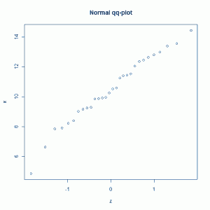
plot(z,x,main='Normal qq-plot')

That gives us the following plot:

The points look like they're on a straight line, as they should. R has a built in function for this called qqnorm. All you have to do is type:

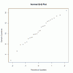
qqnorm(x)

And you get:

Which looks like what we did the first time but with axis labels.

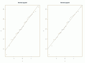
If we want we can draw a straight line through the plot to help us gauge just how close to a straight line the points lie. One choice is to draw the least-squares line. Another is to use the formula \( x = z\sigma + \mu\) using our mean and standard deviation estimates for \( \mu\) and \( \sigma\) . In other words plot the line \( x = zs + \overline{x}\). Let's do both:

# create qq-plot with straight lines
par(mfrow=c(1,2))
plot(z,x,main='Normal qq-plot')
abline(lm(x~z)) # draw best fitting line
plot(z,x,main='Normal qq-plot')
abline(a=mean(x),b=sd(x)) # draw line with slope = std dev and intercept = x-bar

Here's the plot:

It's really hard to tell the difference between the two, but the points seem to lie pretty close to both straight lines.

So that's how Normal qq-plots work. But keep in mind that qq-plots are not just for assessing Normality. You can assess whether or not a sample came from, say, a chi-square distribution or a gamma distribution. Let's generate 30 points from a chi-square distribution with 4 degrees of freedom, and then construct two qq-plots: one with chi-square quantiles and the other with Normal quantiles.

# generate random sample from chi-sq(df=4)
c <- sort(rchisq(30,df=4))
# compare normal and chi-square qq-plots
k <- (1:30)/31
q <- qnorm(k)
cq <- qchisq(k,df=4)
par(mfrow=c(1,2))
plot(cq,c,main='chi-square qq-plot')
abline(lm(c~cq)) # draw best fitting line
plot(q,c,main='Normal qq-plot')
abline(lm(c~q)) # draw best fitting line

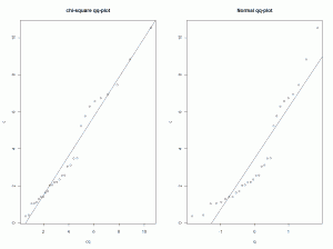
This gives us the following plots:

We see in the left plot our two quantiles lying pretty close to a straight line. They should. That's the chi-square qq-plot and our data are from a chi-square distribution. On the right however we see a fit that's not so good, especially in the extremes. That's our Normal qq-plot. Since our data come from a chi-square distribution, which is skewed right, it makes sense that the Normal qq-plot would show large deviations from a straight line in the "tails" of the plot.
Evidence of the truth of the Central Limit Theorem

The Central Limit Theorem is really amazing if you think about it. It says that the sum of a large number of independent random variables will be approximately normally distributed almost regardless of their individual distributions. Now that’s a mouthful and perhaps doesn’t sound terribly amazing. So let’s break it down a bit. “A large number of independent random variables” means any random variables from practically any distribution. I could take 6 observations from a binomial distribution, 2 from a uniform and 3 from a chi-squared. Now sum them all up. That sum has an approximate normal distribution. In other words, if I were to repeatedly take the observations I stated before and calculate the sum (say a 1000 times) and make a histogram of my 1000 sums, I would see something that looks like a Normal distribution. We can do this in R:

# Example of CLT at work
tot <- vector(length = 1000)
for(i in 1:1000){
  s1 <- rnorm(10,32,5)
  s2 <- runif(12)
  s3 <- rbinom(30,10,0.2)
  tot[i] <- sum(s1,s2,s3)
}
hist(tot)

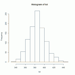
See what I mean? I took 10 random variables from a Normal distribution with mean 32 and standard deviation 5, 12 random variables from a uniform (0,1) distribution, and 30 random variables from a Binomial (10,0.2) distribution, and calculated the sum. I repeated this a 1000 times and then made a histogram of my sums. The shape looks like a Normal distribution, does it not?

Now this is NOT a proof of the Central Limit Theorem. It's just evidence of its truth. But I think it's pretty convincing evidence and a good example of why the Central Limit Theorem is truly central to all of statistics.

Explaining and simulating an F distribution

I remember feeling very uncomfortable with the F distribution when I started learning statistics. It comes up when you’re learning ANOVA, which is rather complicated if you’re learning it for the first time. You learn about partitioning the sum of squares, determining degrees of freedom, calculating mean square error and mean square between-groups, putting everything in a table and finally calculating something called an F statistic. Oh, and don’t forget the assumptions of constant variance and normal distributions (although ANOVA is pretty robust to those violations). There’s a lot to take in! And that’s before you calculate a p-value. And how do you do that? You use an F distribution, which when I learned it meant I had to flip to a massive table in the back of my stats book. Where did that table come from and why do you use it for ANOVA? I didn’t know, I didn’t care. It was near the end of the semester and I was on overload.

I suspect this happens to a lot of people. You work hard to understand the normal distribution, hypothesis testing, confidence intervals, etc. throughout the semester. Then you get to ANOVA sometime in late November (or April) and it just deflates you. You will yourself to understand the rules of doing it, but any sort of intuition for it escapes you. You just want to finish the class.

This post attempts to provide an intuitive explanation of what an F distribution is with respect to one-factor ANOVA. Maybe someone will read this and benefit from it.

ANOVA stands for ANalysis Of VAriance. We’re analyzing variances to determine if there is a difference in means between more than 2 groups. In one-factor ANOVA we’re using one factor to determine group membership. Maybe we’re studying a new drug and create three groups: group A on 10 mg, group B on 5 mg, and group C on placebo. At the end of the study we measure some critical lab value. We take the mean of that lab value for the three groups. We wish to know if there is a difference in the means between those three population groups (assuming each group contains a random sample from three very large populations).

The basic idea is to estimate two variances and form a ratio of those variances. If the variances are about the same, the ratio will be close to 1 and we have no evidence that the populations means differ based on our sample.

One variance is simply the mean of the group variances. Say you have three groups. Take the variance of each group and then find the average of those variances. That’s called the mean square error (MSE). In symbol-free mathematical speak, for three groups we have:

MSE = variance(group A) + variance(group B) + variance(group C) / 3

The other variance is the variance of the sample means multiplied by the number of items in each group (assuming equal sample sizes in each group). That’s called mean square between groups (MSB). It looks something like this:

MSB = variance(group means)*(n)

The F statistic is the ratio of these two variances: F = MSB/MSE

Now if the groups have the same means and same variance and are normally distributed, the F statistic has an F distribution. In other words, if we were to run our experiment hundreds and hundreds of times on three groups with the same mean and variance from a normal distribution, calculate the F statistic each time, and then make a histogram of all our F statistics, our histogram would have a shape that can be modeled with an F distribution.

That’s something we can do in R with the following code:

# generate 4000 F statistics for 5 groups with equal means and variances
R <- 4000
Fstat <- vector(length = R)
for (i in 1:R){
  g1 <- rnorm(20,10,4)
  g2 <- rnorm(20,10,4)
  g3 <- rnorm(20,10,4)
  g4 <- rnorm(20,10,4)
  g5 <- rnorm(20,10,4)
  mse <- (var(g1)+var(g2)+var(g3)+var(g4)+var(g5))/5
  M <- (mean(g1)+mean(g2)+mean(g3)+mean(g4)+mean(g5))/5
  msb <- ((((mean(g1)-M)^2)+((mean(g2)-M)^2)+((mean(g3)-M)^2)+((mean(g4)-M)^2)+((mean(g5)-M)^2))/4)*20
  Fstat[i] <- msb/mse
}
# plot a histogram of F statistics and superimpose F distribution (4, 95)
ylim <- (range(0, 0.8))
x <- seq(0,6,0.01)
hist(Fstat,freq=FALSE, ylim=ylim)
curve(df(x,4,95),add=T) # 5 - 1 = 4; 100 - 5 = 95

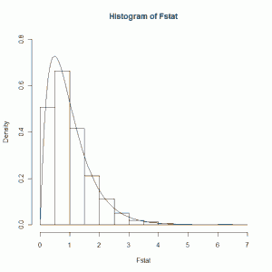
So I have 5 normally distributed groups each with a mean of 10 and standard deviation of 4. I take 20 random samples from each and calculate the MSE and MSB as I outlined above. I then calculate the F statistic. And I repeat 4000 times. Finally I plot a histogram of my F statistics and super-impose a theoretical F distribution on top of it. I get the resulting figure:

This is the distribution of the F statistic when the groups samples come from Normal populations with identical means and variances. The smooth curve is an F distribution with 4 and 95 degrees of freedom. The 4 is Number of Groups - 1 (or 5 - 1). The 95 is from Total Number of Observations - Number of Groups (or 100 - 5). If we examine the figure we see that we most likely get an F statistic around 1. The bulk of the area under the curve is between 0.5 and 1.5. This is the distribution we would use to find a p-value for any experiment that involved 5 groups of 20 members each. When the populations means of the groups are different, we get an F statistic greater than 1. The bigger the differences, the larger the F statistic. The larger the F statistic, the more confident we are that the population means between the 5 groups are not the same.

There is much, much more that can be said about ANOVA. I'm not even scratching the surface. But what I wanted to show here is a visual of the distribution of the F statistic. Hopefully it'll give you a better idea of what exactly an F distribution is when you're learning ANOVA for the first time.

Independence vs. Mutually Exclusive

I used to tutor undergrad students in statistics when I was in grad school. One question that almost every student asked me was to explain the difference between “independence” and “mutually exclusive”. Of course there’s the probabilistic definitions:

If \( P(A \cap B) = P(A)P(B)\), then the events A and B are independent.

If \( A \cap B = \emptyset\) then the events A and B are mutually exclusive.

But that can be a little too abstract for a new statistics student. Here’s what I would tell them.

When we talk about independence, we’re talking about a series of events. The classic example is a series of coin flips. The outcome of the first flip (or first 10,000 flips) has no effect on the probability of the next flip. The flips are independent. The probability does not change from flip to flip. The same concept can be applied to answers to a particular question on a survey taken by a 100 people, or a vital sign taken from each patient in a clinical trial treatment group, or weight measurements of a random sample of candy bars rolling off an automated production line. We can think of all those as being independent measurements. Because someone in Chicago said “yes” to a survey question doesn’t change the probability that someone in Dallas will also respond “yes”. Again, we’re talking about a series of events and whether or not the probability of the event outcomes change based on earlier event outcomes. The counter-example to independence is drawing cards. The probability of drawing, say, a King changes from draw to draw if you do not replace the cards. If your first draw is a 10, you have a slightly better chance of drawing a King on the next draw because of the size of the deck decreased by 1 card.

When we talk about events being mutually exclusive, we’re talking about observing one outcome and whether or not some or all of the events can occur at the same time. If I flip a coin once, I will either observe a head or tail, not both. The events are mutually exclusive for that outcome. Same with rolling dice. One roll and I will observe one side. I can’t observe both a 2 and 5 on one roll. The events are mutually exclusive. A baby is born. It will either be a boy or a girl. The events are mutually exclusive. I take a sample of blood from someone to determine the blood type. It will be one type, say O-negative. It can’t be two types.

So that’s the main idea for a high-level distinction between the two:

  1. Independence deals with probability of outcomes over a series of events.
  2. Mutually exclusive deals with the possibility of events in a single outcome.

Now the ultimate gotcha question is can a pair of events be simultaneously mutually exclusive and independent? In other words, if two events are possible (ie, they have a probability greater than 0), then can they both be mutually exclusive and independent? The answer is No.

If A and B are mutually exclusive, then \( A \cap B = \emptyset\), which implies \( P(A \cap B) = 0\). If A and B are independent, then \(P(A \cap B) = 0\), but both A and B have positive probability so that can’t be. So A and B are not independent.

Likewise, if A and B are independent, we have \( P(A \cap B) = P(A)P(B) > 0\) since both events are possible. But as we saw before, if two events are mutually exclusive then \( P(A \cap B) = 0\). So A and B can’t be mutually exclusive if they’re independent.