I was working through some R code from the excellent textbook Analysis of Categorical Data with R 2nd ed and came across the following simple example that models the probability of a placekick being “good” as a function of distance.
URL <-"https://www.chrisbilder.com/categorical/Chapter2/Placekick.csv"placekick <-read.csv(URL)mod.fit <-glm(formula = good ~ distance, family =binomial(link = logit), data = placekick)faraway::sumary(mod.fit)
              Estimate Std. Error z value  Pr(>|z|)
(Intercept)  5.8120798  0.3262771  17.813 < 2.2e-16
distance    -0.1150267  0.0083391 -13.794 < 2.2e-16

n = 1425 p = 2
Deviance = 775.74504 Null Deviance = 1013.42617 (Difference = 237.68112)
The authors then provide a custom function to estimate the probability of a kick being good from a specified distance along with a 95% confidence interval.
I appreciate the authors presenting this function. It’s always good to see how to do these things “by hand”. But this sent me down a rabbit hole to find R packages that implement this functionality.
emmeans
My first package to test was emmeans. The authors of the book use this package quite a bit in the exposition and I rely on it myself. Notice we have to provide the specific distances as a list object to the “at” argument. We also need to set type = "response" to get probabilities instead of log odds.
library(emmeans)emmeans(mod.fit, specs ="distance", at =list(distance =c(20, 50)), type ="response")
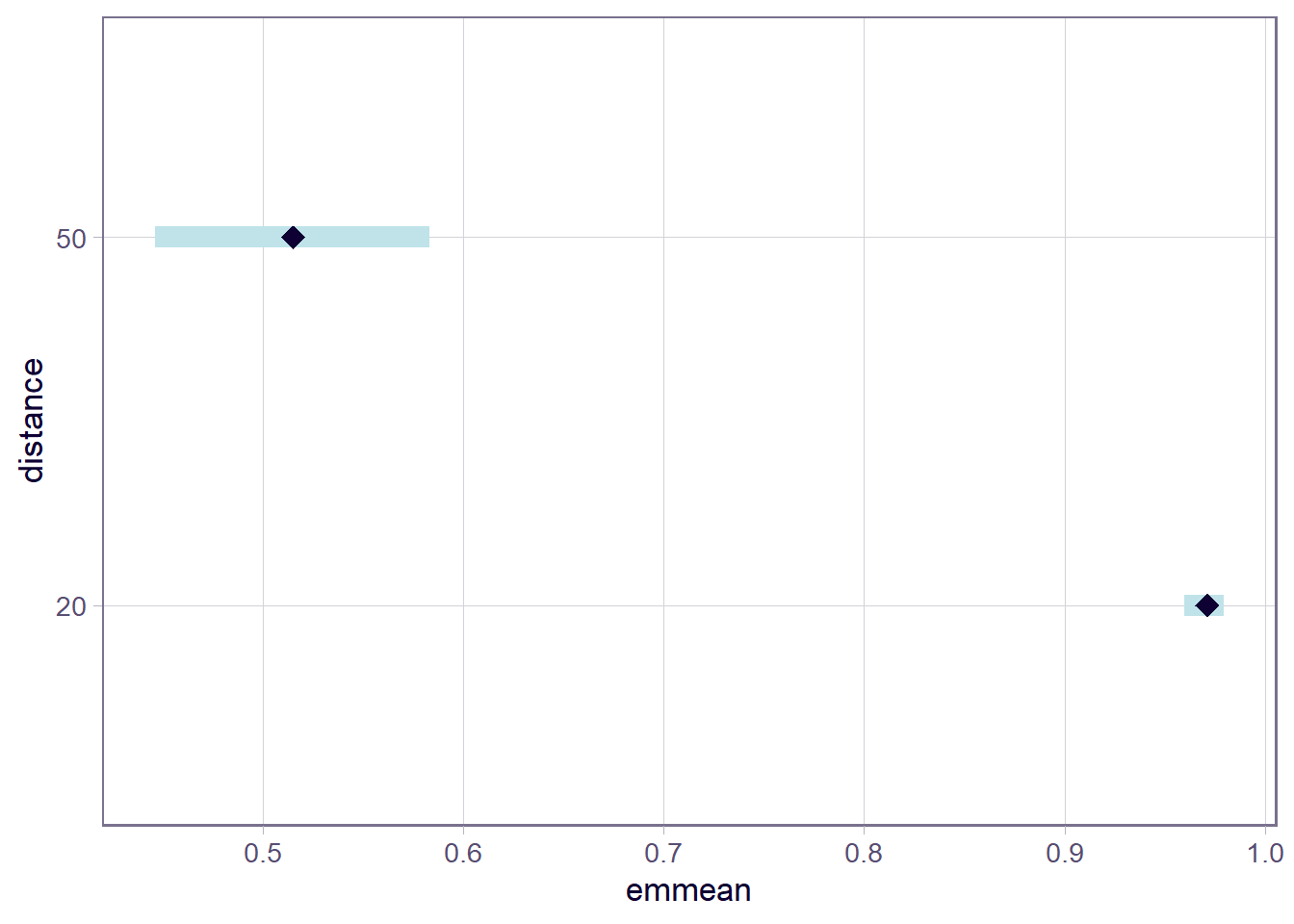
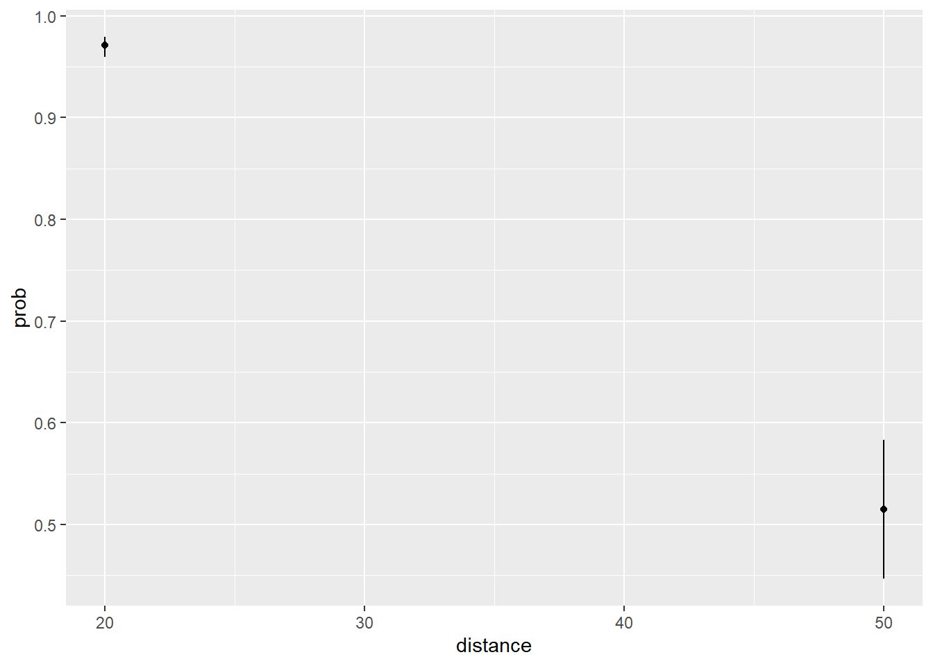
 distance  prob      SE  df asymp.LCL asymp.UCL
       20 0.971 0.00488 Inf     0.960     0.979
       50 0.515 0.03500 Inf     0.447     0.583

Confidence level used: 0.95
Intervals are back-transformed from the logit scale
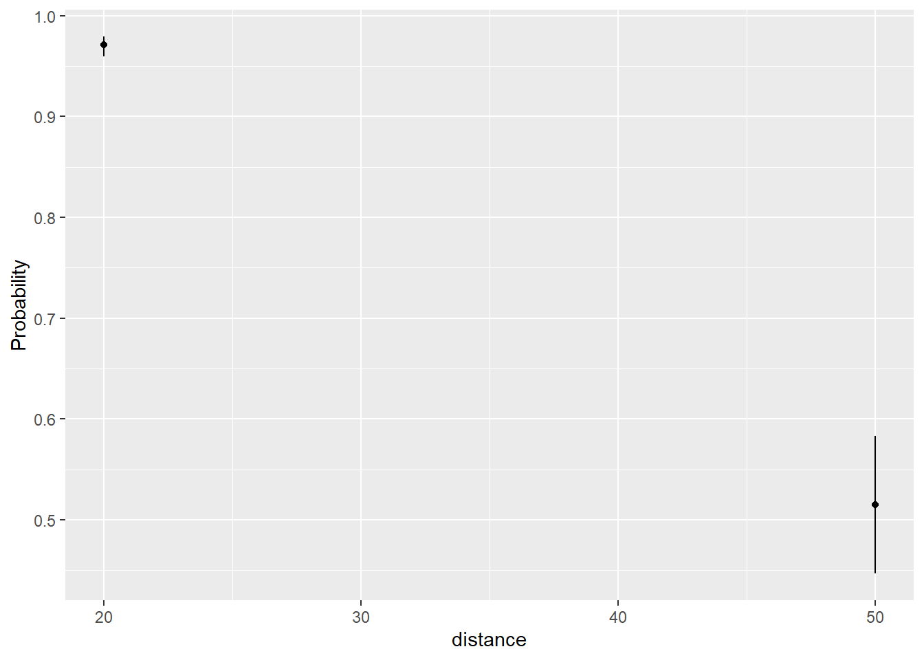
The nice thing about emmeans is that we can pipe the result into a plot() method and get a decent visualization.
emmeans(mod.fit, specs ="distance", at =list(distance =c(20, 50)), type ="response") |>plot()
We can save the emmeans result and make our own plot using ggplot2. Just make sure to use the as.data.frame() method to get a data frame.
library(ggplot2)emdf <-emmeans(mod.fit, specs ="distance", at =list(distance =c(20, 50)), type ="response") |>as.data.frame()ggplot(emdf) +aes(x = distance, y = prob) +geom_point() +geom_errorbar(aes(ymin = asymp.LCL, ymax = asymp.UCL), width =0)
ggeffects
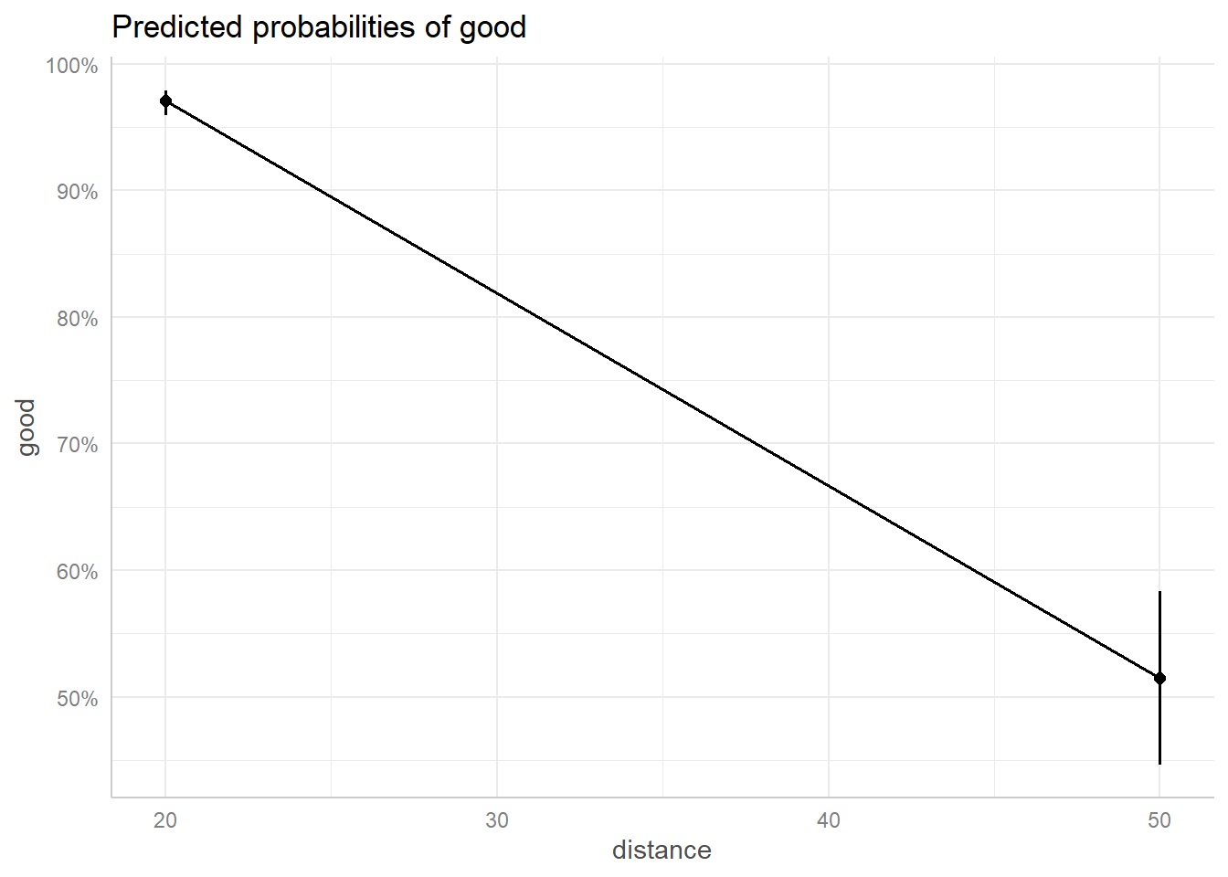
My next package to try was ggeffects. I’ve been a long time user of the ggpredict() function to quickly get predicted values from a model. I like the custom syntax that allows you to specify specific values in brackets next to the variable name. And it converts to probabilities by default.
# Predicted probabilities of good

distance | Predicted |     95% CI
---------------------------------
      20 |      0.97 | 0.96, 0.98
      50 |      0.52 | 0.45, 0.58
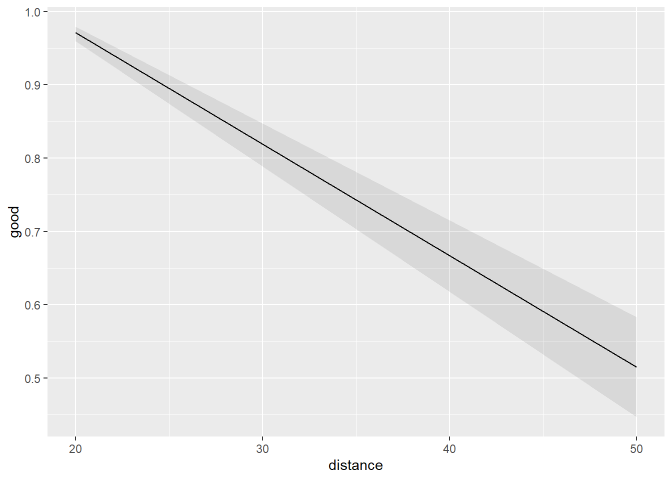
We can also pipe the result into a plot() method for a nice-looking plot. We specify ci_style = "errorbar" to restrict the plotting to the two points of interest, but the points are needlessly connected by a line.
I really do love the ggeffects package. I find it so easy and intuitive to use. But I recently noticed the developer has placed the package in maintenance mode and is encouraging users to switch to a new package called modelbased. So I decided to give this package a try. The function we want to use for this task is estimate_expectation(). To specify points, we use the “data” argument which requires a data frame.
library(modelbased)
Attaching package: 'modelbased'
The following objects are masked from 'package:ggeffects':

    pool_predictions, residualize_over_grid
estimate_expectation(mod.fit, data =data.frame(distance =c(20,50)))
Model-based Predictions
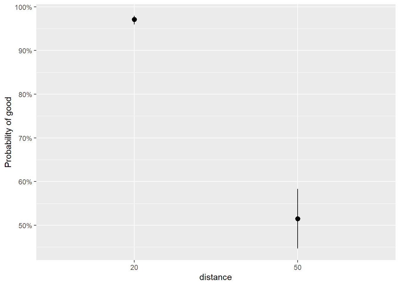
distance | Predicted | SE | 95% CI
----------------------------------------------
20 | 0.97 | 4.88e-03 | [0.96, 0.98]
50 | 0.52 | 0.04 | [0.45, 0.58]
Variable predicted: good
Predictions are on the response-scale.
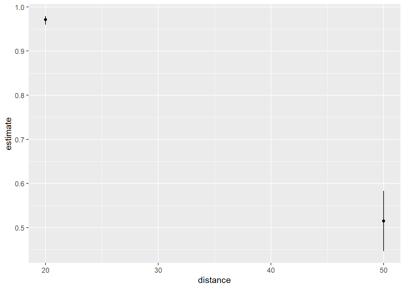
As with ggeffects, we can pipe this result into a plot() method. The method provides an argument called “join_dots” that allows us to suppress the connecting of the the dots.
estimate_means(mod.fit, by =c("distance = c(20,50)")) |>plot(join_dots =FALSE)
Like ggeffects, we can save the result and get a data frame if we want to make our own plot.
The modelbased package seems to be a worthy successor to ggeffects, but I’m having a hard time switching after using ggeffects for so many years.
marginaleffects
The last package I tried was the marginaleffects package. This is the package I am least familiar with, but judging from its online book it’s a package I should learn more about. It appears to be quite powerful. The function we want to use is the predictions() function. We have to supply the specified distances as a datagrid object.
There is no option to pipe the result into a plot() method as far as I can tell. It looks like you need to use a dedicated function called plot_predictions().
This isn’t the plot I want and I can’t figure out if there’s a way to make it using the arguments available in the plot_predictions() function. However, we can extract a data frame and make the plot ourselves by setting draw = FALSE.
The analysis was done using the R Statistical language (v4.5.2; R Core Team, 2025) on Windows 11 x64, using the packages marginaleffects (v0.31.0), emmeans (v2.0.0), ggeffects (v2.3.1), modelbased (v0.13.0) and ggplot2 (v4.0.1).